


|
|
| FAQ/Help |
| Calendar |
| Search |
|
#1
 Nov 05, 2007, 06:45 AM
|
|||
|
|||
|
Hey. I'm battling with powerpoint. What I need... Is an image that I can't find (and don't know how to create). Don't laugh... But I've included a freehand rendition (small Word document).
Basically... I want a normal curve with chunks cut out of it. I've heard that intelligence works like that (or might work like that) which (might) show that people have some kind of inner deficit or disorder rather than mere normal variation. If someone knows what this kind of curve is called (the curve with chunks cut out of it) that would really help me with google images. Thanks. |
|
#2
Nov 05, 2007, 12:08 PM
|
||||
|
||||
|
I think you're looking for a standard deviation bell curve.
splitimage
__________________
 "I danced in the morning when the world was begun. I danced in the moon and the stars and the sun". From my favourite hymn. "If you see the wonder in a fairy tale, you can take the future even if you fail." Abba 
|
|
#3
Nov 05, 2007, 12:25 PM
|
||||
|
||||
|
__________________
"Never give a sword to a man who can't dance." ~Confucius |
|
#4
Nov 05, 2007, 08:23 PM
|
|||
|
|||
|
yeah, i standard deviation bell curve - with chunks cut out of it. i'm not sure that i googled that, though, so i'll give it a shot - thankyou.
thanks for that Perna. I did indeed start with trying to do things that way. It was a helpful think, though. I think I might try again... |
|
#5
Nov 05, 2007, 08:30 PM
|
||||
|
||||
|
Maybe do something like this:
http://scene.asu.edu/habitat/stats_stuff/bell_curve.gif and make the chunks by controlling the height of the columns in some way?
__________________
"Never give a sword to a man who can't dance." ~Confucius |
|
#6
Nov 05, 2007, 09:11 PM
|
||||
|
||||
|
Could you do it first in Excel by plotting the numbers then generating a graph, then import it into Powerpoint? That would be the most accurate way.
__________________
thatsallicantypewithonehand |
|
#7
Nov 05, 2007, 09:52 PM
|
|||
|
|||
 if i knew how to use excel then i might be able to... if i knew how to use excel then i might be able to...i'm not particularly tecnically proficient. typically i just use word (and don't even know how to set up templates!) i've just started learning how to do pics and custom animations in ppt. (I've attached a slide as an example. If you view it as a slideshow then clicking with the mouse will advance the elements of the slide). Don't ask how long that took me!) Actually... I can't attach it because ppt isn't: .txt,.gif,.jpg,.png,.zip,.pdf,.doc One worry that I have... Is that I'm not going to be using my laptop I'll be borrowing someone elses. Someone had a problem with my animations when they used a Mac. Am I likely to find that just with Mac's or with other PC's as well?? |
|
#8
Nov 05, 2007, 09:53 PM
|
|||
|
|||
|
ok... i'll try!
|
|
#9
Nov 05, 2007, 09:55 PM
|
|||
|
|||
|
ok. i can attach it as a word doc, but you won't get to see animations.
because i wanted the different segments of the triangle to be different colours i had to make a different shape for each colour and then slot them together. actually... there are a number of triangles that are basically stacked on top of one another. couldn't just make one triangle then draw lines across it then colour the different segments differently. |
|
#10
Nov 05, 2007, 09:59 PM
|
||||
|
||||
|
If you want to email me the raw data, I might be able to put it in Excel and then get you the appropriate graph as a .gif or .jpg, which you could then paste into Powerpoint. I think you have my real email addy, but if not, then PM me if you're interested. I'd be happy to help.
__________________
thatsallicantypewithonehand |
|
#11
Nov 05, 2007, 10:22 PM
|
|||
|
|||
|
It is imaginary data - I'm just looking for the appropriate shape. I'm using the following for my bell curve:
http://classes.kumc.edu/sah/resource...bell_curve.gif (Found off the net) and covering up the arrows and 'more than usual' by putting yellowish coloured rectangles over them. Now what I was looking for was a bell curve with chunks cut out of the left. If you open up the attachment that is with my very first post to the thread hopefully that would make it clearer... Ideally... I'd have a bell curve... then a bell curve with chunks out of it... In the same format with the same colour etc etc etc. Preferably black background with white lines... But I'm crap crap crappy with these things. (The idea is basically... If we imagine (this is probably false) that people have varying abilities to focus their attention and that the variance in peoples ability falls into a normal distribution... Then we want to know 'where do we draw the line on how severe you need to be in order to qualify as having ADHD? If we draw the line at 2 standard deviations below the mean then we fix prevalence at 2%. If we draw the line at 1 standard deviation below the mean then we fix prevalence at 16%. But how do we decide where to draw the line? If we (rather simplisically) Imagine that the amount of dopamine present in the synaptic cleft of different individuals similarly has a normal distribution... And we grant the (oversimplistic) assumption that 'too little dopamine causes ADHD' then the problem recurrs: How little dopamine qualifies someone as having ADHD? If we draw the line at 2 standard deviations below the mean then we fix prevalence at 2%. If we draw the line at 1 standard deviations below the mean then we fix prevalence at 16%. How do we decide? Then the idea is that it might be that there isn't a normal distribution (of either ability to focus attention, or of amount of dopamine) after all. It might be that there are 'plateaus' where a certain number of people are clustered at a certain ability (or disability) point. Does that give us reason to believe that they have a dysfunction? Not sure... But thats what I want that for at any rate. I've heard... Though maybe this is controversial that we find those plateaus in IQ as well and that is why we think that certain people are disordered compared with just being at the low end of the normal range. But I've googled 'IQ graph' and stuff like that and I'm not finding a normal distribution curve with plateaus / chunks cut out of it. Of course we can run through the whole thing again with serotonin / depression and dopamine / psychosis as well. And since the medications affect ALL people similarly (who doesn't find their cognitive performance improves on low levels of amphetamine???) the effectiveness of medication doesn't help us settle this issue either. The issue is basically... What is it about a person that determines that they have a disorder compared with being within normal range? I'm trying to say... That even when the neuroscience comes in we still won't know the answer to that so we better start looking at our values... And... If too many people take 'performance enhancing' medication then it will be a fitness trap (need to take it to keep up and the cost of defecting will be to high.) Only giving meds to people who are 'disordered' stops it being a fitness trap... But where do we draw the line on who is disordered or not? Is it fairly arbitrary or is there a more systematic distinction than that? So.. The actual data doesn't matter much. And I'm hoping that whether or not attention (or depression or psychosis) falls on a bell curve or not... Whether serotonin or dopamine or whatever falls on a bell curve or not... Whether serotonin or dopamine or whatever actually causes the disorder or not (I know that is far too simple) that it will be enough to illustrate teh basic conceptual point?? - that neuroscience won't tell us whether someone is disordered or not.) |
|
#12
Nov 06, 2007, 12:31 AM
|
|||
|
|||
|
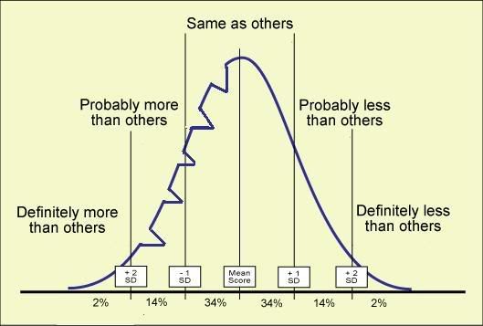
Is this picture getting closer to what you're looking for?
|
|
#13
Nov 06, 2007, 12:44 AM
|
||||
|
||||
|
hahahahahahahahhahaha!!!!!!!!!
__________________
thatsallicantypewithonehand |
|
#14
Nov 06, 2007, 03:20 AM
|
|||
|
|||
|
ROFL.
That is actually pretty close! How the hell did you do that??? Moving from left to right... Up along the curve... Past the +2SD. Then the line goes from the curve to being horizonal, which is great. But then the trouble is that the line (chunk) can't zag back out again. So the whole curve from that point on would have to go from the inner (right) end of the horizontal line. Does that make sense? |
| Reply |
|
|
 Similar Threads
|
||||
| Thread | Forum | |||
| the old cartoons are best**image** | General Social Chat | |||
| need help with image.... | Bipolar | |||
| Image Burned into a TV | Other Mental Health Discussion | |||
| Self image | Depression | |||
My Support Forums is the online community that was originally begun as the Psych Central Forums in 2001. It now runs as an independent self-help support group community for mental health, personality, and psychological issues and is overseen by a group of dedicated, caring volunteers from around the world.


 Linear Mode
